Tolstoy is a vegan eatery that intends to be the new wave of fast-food restaurants. Its concept is based on four central ideas: digital, plant-based, transparency and joy. While planning, the design of the 60s came to mind; when society was reborn, vegetarianism exploded, and colours were a part of a positive statement. We right away thought about a colourful, funky and optimistic place.
How to create a functional but comfortable and appealing space?
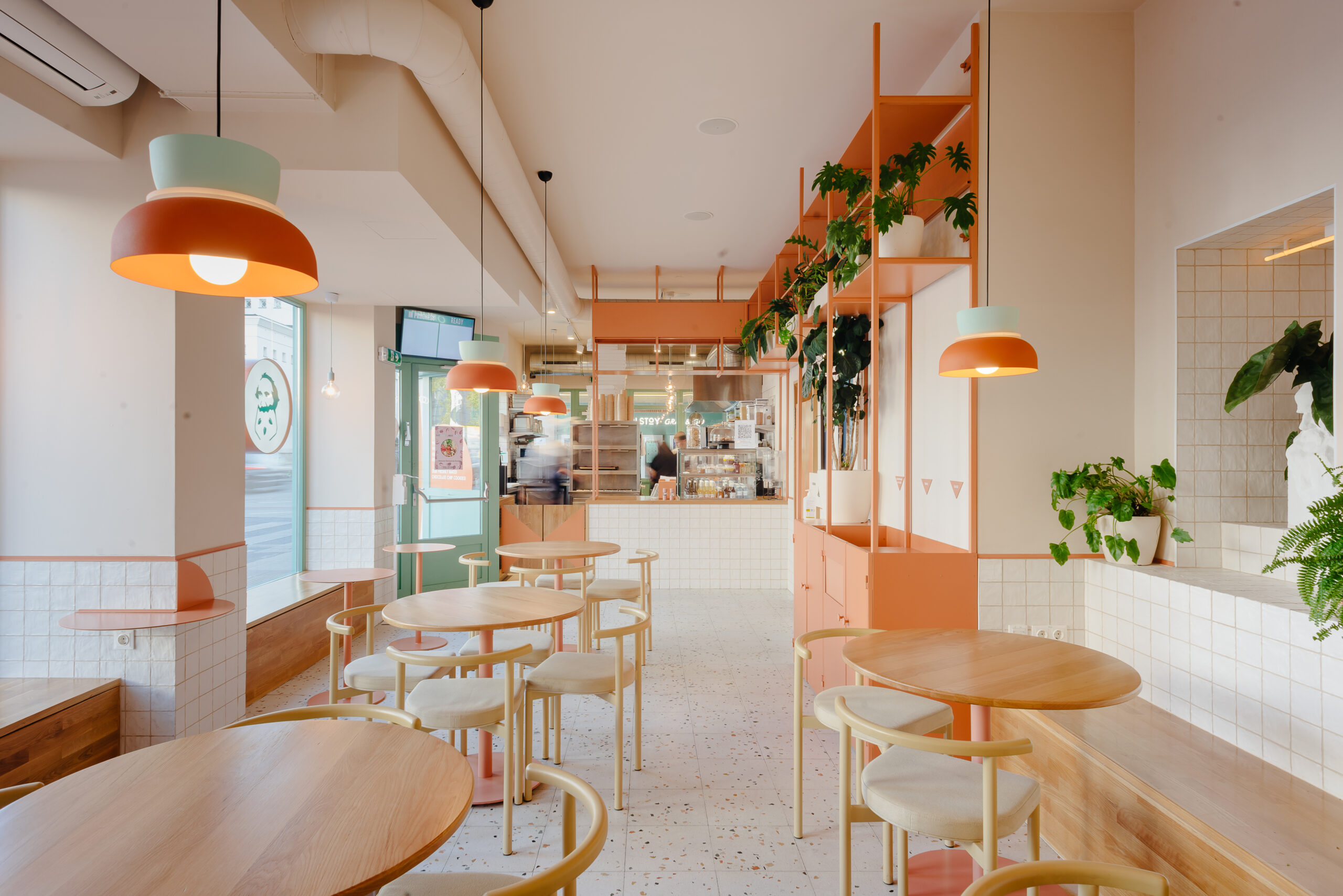
Colours and materials were essential to represent the space’s identity. Metal was chosen for its flexible and resistant attributes, ideal for a more dynamic place like a restaurant; wood for being an organic and comfortable material to which people feel more connected; the tiles for being a more practical and easy-to-clean material, bringing lightness and freshness to the space. Regarding the colours, green relates to nature and serenity, and orange refers to energy and spontaneity, balancing the environment.
How to create a flexible space, adaptable to different customers’ daily lives?
We intended to create a flexible space adapted to people’s daily needs. Therefore, Tolstoy has organized three different sitting areas: the central area, the most social, where people can enjoy more time and space-eating together; the area of the windows, perfect for those who want to relax and enjoy the view outside; the mirror area, a place for people in a hurry, who want just a quick bite or a coffee. Furniture was designed to encourage people to change, adapt and mix the three areas.
How to humanize a digital fast-food space full of screens and tablets?
One of our main focuses was to humanize a digital vegan fast-food space full of screens and tablets. We embraced Tolstoy digital elements and efficiency by integrating them into a more human and engaging environment. It was essential to build a space in which people feel connected!
Despite being a self-service restaurant, it was essential to create a metal cupboard that would respond to the needs of the customer area and the employees, uniting both areas and somehow humanizing the space. The goal was to integrate into the cupboard all the digital elements and all the more practical functions that the room needed (garbage, cutlery, tray area, etc.). In this same cupboard was placed the service countertop, an open-element between the kitchen and the eating area, making it visible to everyone. We also left room for plants and ornaments, making the space more empathic.
How to create a symbolic element for the restaurant?
We designed a niche with Leo Tolstoy’s bust. The niche itself was a surprise, discovered by our construction team during the works. During our trip to Brazil, we were influenced by the culture of altars and how humans can be so devoted to something they believe. So, we decided to design a symbolic element for Tolstoy, but with a specific aesthetic from an internet movement called Vaporwave. This movement combines old neoclassical sculptures and late 90s web design (human vs digital), perfectly fitting the concept of Tolstoy as a digital plant-based eatery.